OmicsHorizon Use Cases
Perform your desired analysis,
such as single-cell, multi-omics, and integrated analysis,
with OmicsHorizon.
Run the analyses you need —
from scRNA sequencing to multi-omics and integrative analysis.
Run the analyses you need —
from scRNA sequencing to multi-omics and integrative analysis.
scRNA Sequencing Analysis
From clustering to marker gene discovery and cell type annotation —
Build insights by analyzing cellular heterogeneity.
Based on the Method section of the uploaded paper,
analyze the attached Cell gene matrix data.
Make sure to include and
show all the Figures from the Results section.
Step 1:
series_matrix.tsv Load the file and check its structure.
Step 2:
Perform quality control (QC) and visualize metrics. (Violin plot)
Step 3:
Normalize the data, select highly variable genes, and then visualize it. (Scatter plot)
Step 4 :
Visualize after performing dimensionality reduction (PCA, UMAP) and clustering.
(UMAP plot)
(UMAP plot)
Step 5:
Find and visualize cluster markers through differential expression analysis. (Dotplot/Matrixplot)
Step 6:
Perform trajectory inference (PAGA/DPT) and visualize it. (Trajectory plot)
1.
Quality Control (QC)
First, we checked the overall quality of the data and removed
low-quality cells and genes that were not suitable for analysis.
Criteria: Only cells with a mitochondrial gene expression ratio (pct_counts_mt) of less than 5%, and cells with a number of expressed genes (n_genes_by_counts) of at least 200 and less than 2500 were filtered.
Result: After filtering, 983 cells and 11,780 genes remained.
(Figure: Violin plots showing the distribution of gene counts, total expression, and mitochondrial gene ratio per cell before and after filtering)

2.
Normalization and Feature Selection
(Normalization & Feature Selection)
We corrected for differences in sequencing depth across cells and selected biologically meaningful genes.
Method
: Total expression per cell was normalized to 10,000, followed by log transformation (Log1p). Highly Variable Genes (HVGs) with high inter-cell expression variability were then identified.Results
: A total of 1,805 highly variable genes were selected for downstream analysis.
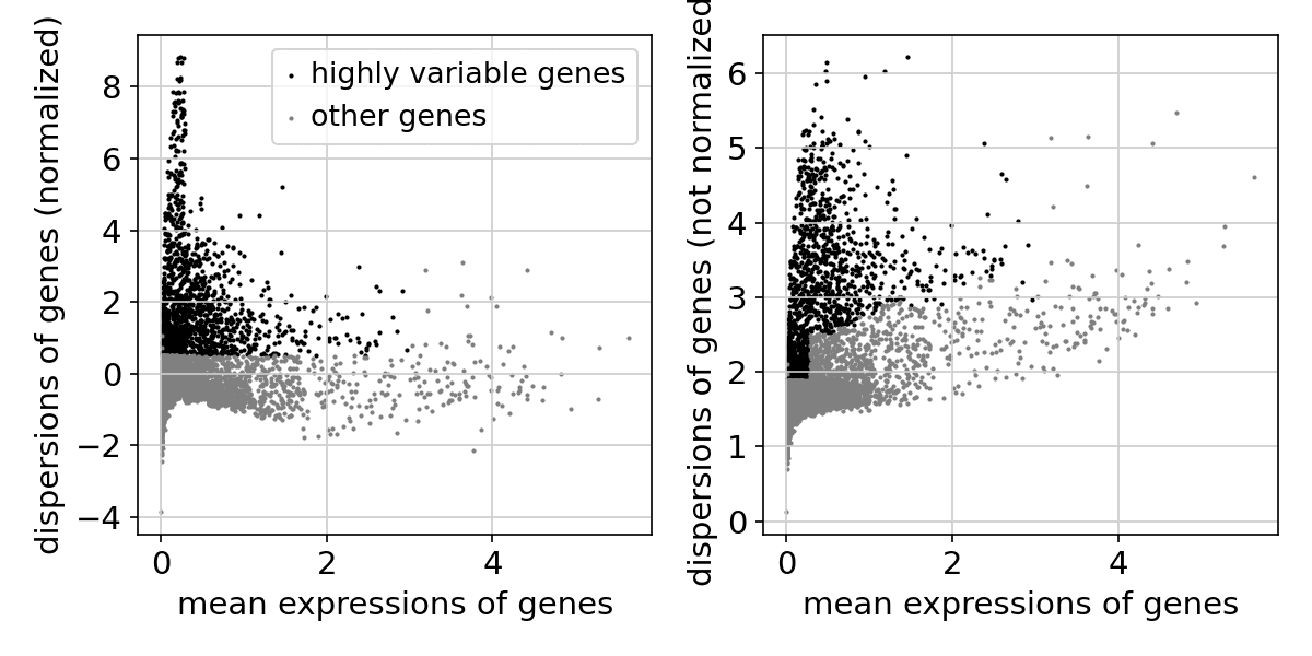
(Figure: Scatter plot showing mean expression vs. variance across genes. Black dots indicate selected highly variable genes.)
3.
Dimensionality Reduction & Clustering
(Dimensionalist Reduction & Clustering)
We projected the complex, high-dimensional data into two dimensions and grouped cells with similar expression patterns.
Methods
: PCA was applied for dimensionality reduction, followed by UMAP projection into 2D space. Cell clustering was performed using the Leiden algorithm (resolution = 0.5).
Results
: Five distinct cell clusters (Clusters 0–4) were identified.
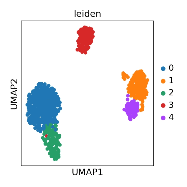
(Figure: UMAP plot showing five clusters, each represented by a different color in 2D space)
4.
Differential Expression Analysis
We identified cluster-specific marker genes to characterize the biological identity of each cluster.
Method
: The Wilcoxon rank-sum test was used to compare each cluster against all other clusters.
Results
: Top marker genes for each cluster were identified. (e.g., Cluster 0: RPS12, LDHB, RPS25, etc.)

(Figure: Dotplot showing the top 5 marker genes per cluster, with dot size indicating expression fraction and color intensity indicating mean expression level)
scRNA Sequencing Analysis
From clustering to marker gene discovery,
to cell type annotation —
analyze heterogeneity at the cellular level
and build up insights.
Based on the Method section of the uploaded paper, please analyze the attached
Cell gene matrix data.
You must show all figures in the
Results section.
Step 1:
series_matrix.tsv Load the file and check its structure.
Step 2:
Perform quality control (QC) and visualize metrics.(Violin plot)
Step 3:
Normalize the data, select highly variable genes, and then visualize them.
(Scatter plot)
Step 4:
Visualize after performing dimensionality reduction (PCA, UMAP) and clustering.
(UMAP plot)
Step 5:
Identify and visualize cluster markers through differential expression analysis. (Dotplot/Matrixplot)
Step 6 :
Performs trajectory inference (PAGA/DPT) and visualizes it (Trajectory plot).
1.
Quality Control
(QC)
First, the overall quality of the data was checked, and
low-quality cells and genes unsuitable for analysis were removed.
Criteria
: Selected only cells with a mitochondrial gene expression ratio (pct_counts_mt) of less than 5%
and an expressed gene count (n_genes_by_counts) between 200 and 2,500.Results
: After filtering, 983 cells and 11,780 genes remained.
(Figure: Violin plots showing the distribution of gene counts, total expression, and mitochondrial gene ratio per cell before and after filtering)
2.
Normalization and Feature Selection
(Normalization & Feature Selection)
We corrected for sequencing depth differences between cells and selected genes with high biological significance.
Method
: After normalizing the total expression of each cell to 10,000, we performed log transformation (Log1p)
and then extracted highly variable genes (Highly Variable Genes, HVGs) with large expression variance across cells.Result
: A total of 1,805 highly variable genes were identified and used for downstream analysis.
3.
Dimensionality Reduction and Clustering
(Dimensionality Reduction & Clustering)
We visualized complex high-dimensional data in two dimensions and grouped cells with similar expression patterns. Grouped them.
Method
: After reducing the dimensions through PCA, we projected the data into
two-dimensional space
using the UMAP algorithm.
For cell clustering, the Leiden algorithm (resolution=0.5)was used.
Results
: A total of 5 distinct cell clusters (Cluster 0 ~ 4) were identified.
(Figure above: a UMAP plot mapped into two-dimensional space with five clusters distinguished by different colors)
4.
Differential Expression Analysis
To identify the biological characteristics of each cluster, we found cluster-specific marker genes.
Method
: Using the Wilcoxon rank-sum test, we compared each cluster with all other clusters.
Results
: Top marker genes representing each cluster were identified. (e.g., for cluster 0: RPS12, LDHB, RPS25, etc.)
(Figure above: Dot plot showing the average expression levels (color intensity) and expression proportions (dot size) of the top 5 marker genes in each cluster)
scRNA Sequencing Analysis
From clustering to marker gene discovery to cell type annotation —
build insights by analyzing cellular heterogeneity.
Please analyze the attached Cell gene matrix data based on the Method section of the uploaded paper.
You must show all figures in the Results section, including them all.
Step 1:
series_matrix.tsv Load the file and inspect its structure.
Step 2:
Performs quality control (QC) and visualizes metrics. (Violin plot)
Step 3 :
Normalize the data, select highly variable genes, and then visualize them.
(Scatter plot)
(Scatter plot)
Step 4:
Visualize after performing dimensionality reduction (PCA, UMAP) and clustering.
(UMAP plot)
(UMAP plot)
Step 5:
Find and visualize cluster markers through differential expression analysis. (Dotplot/Matrixplot)
Step 6:
Performs trajectory inference (PAGA/DPT) and visualizes it. (Trajectory plot)
2.
Normalization and Feature Selection
(Normalization & Feature Selection)
We corrected for differences in sequencing depth between cells and selected biologically meaningful
genes.
Method:
The total expression of each cell was normalized to 10,000, then log-transformed (Log1p).
Next, highly variable genes (Highly Variable Genes, HVGs) with large expression variability between cells were extracted.
Results:
A total of 1,805 highly variable genes were identified and used for downstream
analysis.
1.
Quality Control (QC)
First, we checked the overall quality of the data and removed low-quality
cells and genes that were not suitable for analysis.
Criteria:
We filtered only cells with a mitochondrial gene expression ratio (pct_counts_mt) of
less than 5% and a number of expressed genes (n_genes_by_counts) of at least 200 and fewer than 2500.
Result:
After filtering, 983 cells and 11,780 genes remained.
(Figure: Violin plots showing the distribution of gene counts, total expression, and mitochondrial gene ratio per cell before and after filtering)
3.
Dimensionality Reduction and Clustering
(Dimensionality Reduction & Clustering)
We projected the complex, high-dimensional data into two dimensions and grouped cells with similar expression patterns.
Method: PCA was applied for dimensionality reduction, followed by UMAP projection into 2D space. Cell clustering was performed using the Leiden algorithm (resolution = 0.5).
Result: Five distinct cell clusters (Clusters 0–4) were identified.
(Figure: UMAP plot showing five clusters, each represented by a different color in 2D space)
4.
Differential Expression Analysis
(Differential Expression Analysis)
To understand the biological characteristics of each cluster, we identified cluster-specific marker genes.
Method
: Using the Wilcoxon rank-sum test, we compared each cluster with all other
clusters.
Results
: Top marker genes representing each cluster were identified.
(e.g., for cluster 0, RPS12, LDHB, RPS25, etc.)
(Figure above: Dot plot showing the average expression levels (color intensity) and expression proportions (dot size) of the top 5 marker genes in each cluster)